How to Build a Brand Color Palette
A step-by-step guide to choosing colors that do more than just look good—they tell your story.
Visual branding isn’t just about aesthetics. It’s about making people feel something—and remember you because of it. Your brand’s color palette should be one of the most intentional tools in your design toolkit. Whether you’re building a brand from scratch or refreshing an existing one, this guide walks you through the essentials of creating a cohesive, strategic, and ownable color palette.
Start With Your Anchors

Before you dive into funky accent shades or trendy gradients, ground your palette with two essential neutrals:
One light base (think background or canvas)
One dark base (think type, outlines, or contrast)
These are your day-one workhorses. They should offer strong legibility, balance the palette, and support everything else you layer on top.
At Known & Heard, we rely on:
Dark Brown
#41322D– rich and earthy, perfect for typeAlmond
#E6DFD6– soft and warm, a neutral that vintage
These tones keep things cohesive no matter how bold our accent colors get.
Define the Feeling
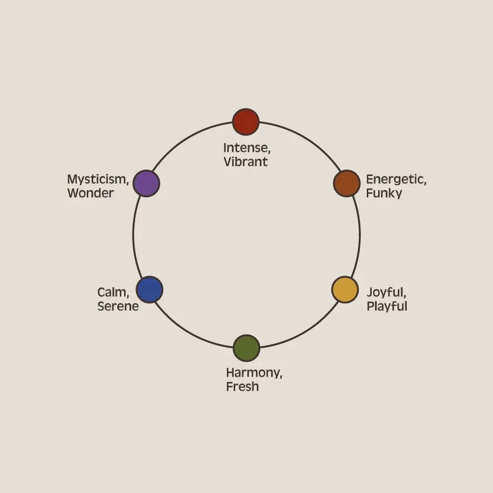
Ask yourself: What do I want people to feel when they see my brand?
Your colors should reflect that vibe with intention.
Here are a few feelings color can evoke:
Intense, Vibrant (like cherry red or electric blue)
Energetic, Funky (like tangerine or neon green)
Joyful, Playful (like marigold or bubblegum)
Fresh, Harmonious (like mossy green or mint)
Calm, Serene (like dusty blue or cool lavender)
Mysterious, Wonder-filled (like eggplant or indigo)
Color is psychology in action. Pick tones that reinforce your brand’s personality, not just what’s trending on Pinterest.
Build Your Palette
Once you’ve chosen your anchors and defined your vibe, it’s time to build your palette.
1–2 Core Colors
These should visually represent your brand’s core energy. They’ll show up most often in your logo, headers, or standout moments.2–3 Accent Colors
These add contrast, create visual interest, and help guide hierarchy across your site, packaging, and social content.
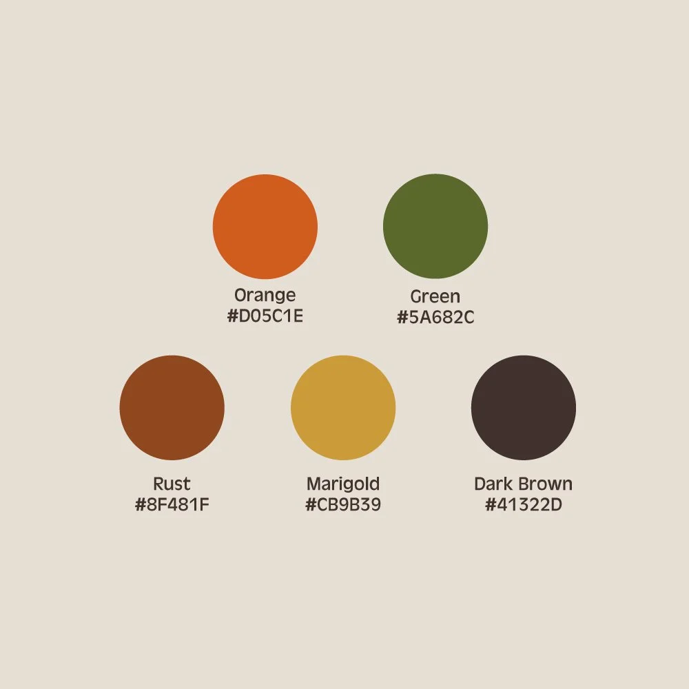
At Known & Heard, we use:
Orange
#D05C1E– our bold, extroverted leadRust
#8F481F– a warm, nostalgic bridgeGreen
#5A682C– grounding and nature-connectedMarigold
#CB9B39– our playful pop
Together, these bring warmth, heritage, and creative energy to everything we design.
Bonus Tip:
Keep accessibility in mind—contrast matters for readability.
Hot Take:
You might fall totally in love with a palette or a certain color, but once you get into design, it just doesn’t work. That’s normal. Color needs to be functional across assets. Sometimes you have to let that perfect shade of chartreuse go. You want to set yourself and your client up for success - not something they are stuck with trying to make work.